Charts and graphs are a great way to share important information about your project. These three simple charts and graphs will help you communicate project information in a way your audience can take in quickly.

When you’re sharing information about your project, you want to hold your audience’s attention and get your message across clearly.
But maybe you’re not always sure how to do it.
Charts and graphs are the perfect answer when you need to convey a lot of information clearly.
Visual tools give you the ability to share lots of data in a simple picture.
You don’t want to make your audience work hard to understand what you’re telling them.
Give them a picture that sums up a lot of information and they’ll appreciate how well you’re able to communicate.
By using charts and graphs in your project presentation, you can send a more impactful message more quickly.
Thee three common charts and graphs listed below are simple tools to incorporate into your presentations and give them more impact.

Different Types of Charts and Graphs to Use in Your Next Project Presentation for More Impact
Use the following simple charts and graphs to easily display project data.
Your audience will appreciate the time you took to make them.
The time you take to create these will save time later explaining, and your audience will more easily grasp the information.
These charts and graphs are simple to create, easy to understand, and can give your project presentations more impact.
And the more you use them, the better you’ll get at it.
Bar Graph
Bar graphs allow you to show a comparison of information or items against one another. Items are compared against each other and values are shown in bars of different sizes relative to one another.
To illustrate, I created a simple comparison bar graph showing the amount of calcium in different vegetables. It’s easy to see very quickly that collard greens have more calcium than the other items listed.
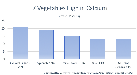
To make the chart above, I took a list of the top vegetables highest in calcium from My Food Data and quickly created a simple bar graph in PowerPoint.
Instead of reading through a boring bullet list, you can quickly see that collard greens and spinach have more calcium than the other vegetables listed.
Here’s another example that’s a bit more work related. If you’re rolling out a software solution, and you need to report on adoption rates, you can show how teams are adopting with a bar graph.
From this image, it’s clear that Blake’s department has a much higher adoption rate than all others. It’s also clear that Marshall’s department is far behind the others.
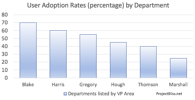
This information gives people the information they can act on if needed, and it’s easier to see and share in a bar graph than simply text.
Line Graph
A line graph will help you show how something has changed over time. You get the benefit of showing various points in time along the line, so readers can see the history.
In a line graph various multiple data points are laid out on a timeline represented by dots on an axis. These dots are connected by a line, making the line chart.
If you want to show a trend, a line chart is a great way to do it.
Here I show an example of how many festivals and events I attended over the year by month.
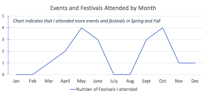
Full disclosure – this is the number of festivals and events I wish I’d attended. The real number is far lower. I need to get out more.
Switching to
From this chart, it’s clear that the number of defects is going down over time.
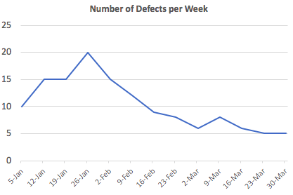
There’s a big point I want to make about this chart. It only tells part of the story.
There’s more that needs to be said if you want to give a more complete story.
If possible, include information about why these defects are going down.
For example, if your team has switched to using Agile and you want to show that it’s reduced the defect rate, include that in your story.
Even better, add that information to the chart.
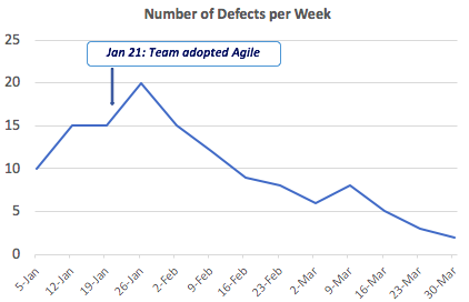
Now anyone that looks at this chart can see that the team adopted Agile on January 21, the defect rate jumped immediately, and then has continued to decline since.
Use a Stacked Line Graph to Show More Information
To show the relationship between two different sets of data, you can plot them on the same chart.
Take a look at the chart below and see if the story is clear to you:
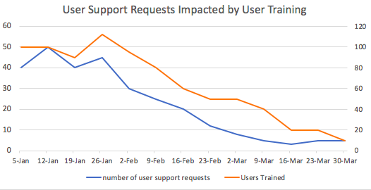
Note: When you use different sets of data, be careful with correlation and causation:
- Causation indicates that one thing causes another. In our chart above, we’re telling the story that training more users reduced the rate of support requests.
- Correlation means things are related, but not that one thing causes another. Just because ice cream sales and shark attacks both increase in the summer doesn’t mean that selling ice cream causes sharks to attack.
When you use line charts, think about what story you want to tell with the data, and determine how to best lay it out. You want your audience to see the story easily.
Pie Chart
A pie chart is useful if you want to show a
Sticking with our user adoption rate example, if you want to show overall adoption rates you could put that information into a pie chart.
This image below shows us that only half the company’s employees are using the new software.
Pie charts aren’t always the best type of chart to use. Unlike the bar graph above, we can’t see the breakdown of which departments are using the new software. The only thing we see is there are many more users that still need to move off the legacy system.
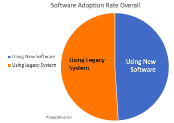
The downside to this chart is that we only see a small snapshot of information. There’s not a lot of
If you’re determined to use a pie chart, to correct this, you could use a series of pie charts, like this:
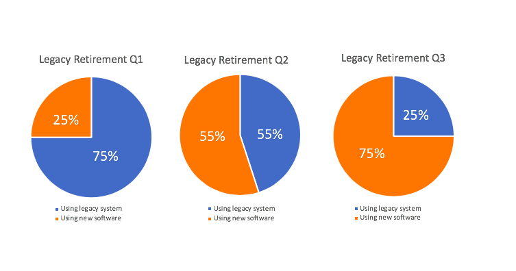
This is still not great. A line chart would give a better picture
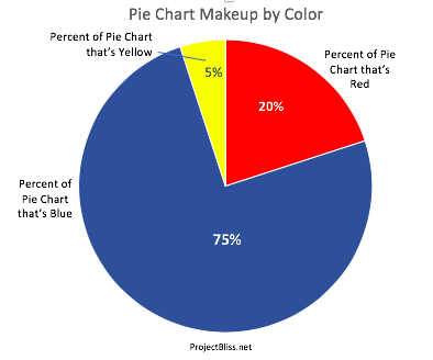
A pie chart is BEST for showing percentage breakdown – like how budgets are allocated – like this:
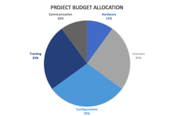
There may be a place for you to use pie charts, so it’s good to consider them at times.
Summary
Use these charts when you want to share project information in a way that’s easy to understand. They’re perfect for sharing data in a way that your audience can understand quickly.
If you’ve got an executive presentation coming up, be sure to check out the awesome (and actionable) advice listed in my book review of Speaking Up: Surviving Executive Presentations.
It’s got great tips from the book you’ll want to use!


No Responses